Sheryl Chan
Visual, Concept & Web Designer
Hello! I'm a recent graduate of the Savannah College of Art and Design, majored in Motion Graphics. I like to bullet journal and take photos of clouds in my free time. Check out my graphic, motion, and illustration works below:
Orange Cheese Co.
✦ Logo Animations✦
Three logo animation designs commissioned by the small business, Orange Cheese Co.The opening of the company was inspired for the owners' love of cheese. The name, "Orange Cheese" derives from the color in which cheese, in its prime state of the year it is in. This business is the bridge between top-tier cheese making in Wisconsin and consumers in China, who are interested in, but rarely have cheese in their everyday diet.
Tools: Windows OS, After Effects, Illustrator, Photoshop
✦ Process✦


Above are the initial sketches and storyboard designs for the three final logo animations.Idea A was based off a cheese wheel that rotates and turns into an orange; a candid pun on the company's name and round shape of the logo.Idea C was based off of rippling water, mirroring how Orange Cheese has grown multiple branches within China after their first location.Idea D was based off of the Chinese characters in the logo design. The main consumers for Orange Cheese are Chinese, therefore I brought out the primary language they read to the forefront to create common ground.
☆ Personal Projects ☆


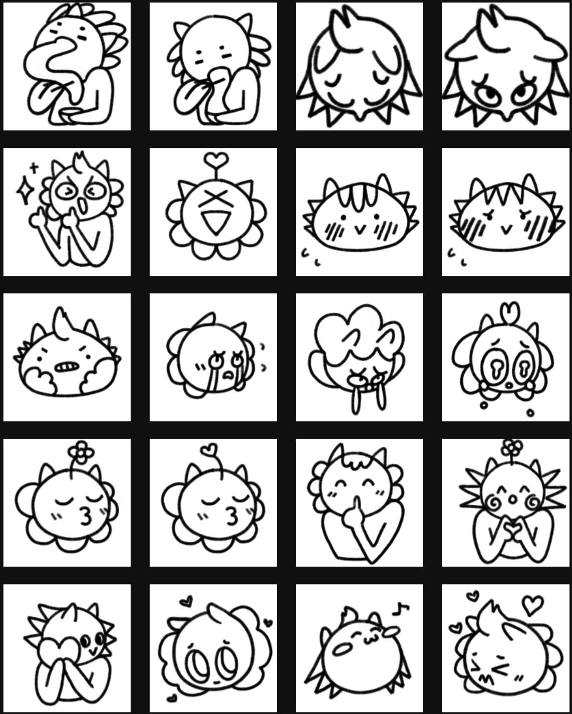
TaiyoRise Emotes
✦ Animations ✦


Commissioned hand-drawn emotes (emoticons) as GIFs for VTuber Twitch Streamer, TaiyoRise.Viewers from around the world subscribe to Taiyo's channel for his comforting, all-encompassing, yet eccentric aura. They are invited to communicate with their lovable lion-boy character through Taiyo's emotes on the unparalleled streaming platform, Twitch, and the exclusive group-messaging service, Discord.Taiyo fell in love with my original sketches of his character, and with my line-work and his coloring, we brought his character to life. All of these emoticon ideas were pulled from researching and watching Taiyo's streams.The focus was to capture Taiyo's likeliness into a quick doodle, which quickly transformed into specific emotions, such as LaughCry and HeadPat, of the viewers' one and only idol of sunshine and positivity.For the stationary graphics, I lined them and Taiyo colored them. For the animated GIFs, I lined, colored, and animated them. It was a lot of fun creating art that Taiyo and his viewers enjoy enough to use.
Tools: Windows OS, After Effects, Autodesk Sketchbook, Samsung Galaxy S6 Tablet
✦ Process ✦


✦ Extras ✦


Rabbit Hole Animation
A frame-by-frame animation created to share what it's like to have many anxieties surrounding dermatillomania, also known as skin-picking disorder. This animation is by no means a generalized representation of people with dermatillomania, just my own personal experience with it.
In a way, this is like a diary entry that I have decided to share to the world; it makes me feel relieved to be able to express my feelings and that there are others that feel this way.The focus for Rabbit Hole was to use elements of rotoscoping, a bright color palette, and use cut transitions between scenes to convey the escalating panic and guilt that arises from not being able to stop picking at my skin in certain moments.This was my senior final project that started while I was at college and ended at the height of quarantining during the beginning of the pandemic.
Tools: Windows OS, After Effects, Photoshop, Phone Camera, Wacom Intuos Pro Tablet
✦ Styleframes✦


Running Man Show Open
A frame-by-frame animation for the Korean variety show, Running Man. The show had 8 main actors with different personas, who then team up or work alone to create a humorous show for their audiences. For each episode, there is a main aesthetic theme and concept with a wide range of minigames.The focus was on channeling Running Man's fun, upbeat vibes through a series of GIF-like animations for each actor. Their poses and fashion are based off of what they usually wear on the show.The vibrant and catchy background music is How People Move by the Korean brother and sister duo, Akdong Musician.
Tools: Mac OS, After Effects, Photoshop, Autodesk Sketchbook App, Wacom Intuos Pro Tablet, Samsung Galaxy S6 Tablet
✦ Styleframes✦


Chameleyon End Credits
An animated end credit sequence representing the three main characters of the animation, My Friend, Chameleyon, which illustrates their imagined after story together.My Friend, Chameleyon is written, directed, and animated by Pamala Lai, my classmate at the time. It is about a toddler who musters her courage to save her best friend, a stuffed chameleyon toy, from the heinous robot-vacuum, who is like a shark in her eyes.The end credits depict the characters befriending each other and going off on an underwater adventure together.
Tools: Windows OS, After Effects, Photoshop, Wacom Intuos Pro Tablet
✦ Styleframes✦


See the Full Project & Animation here:
The Hunter and Fox


The Hunter and Fox is an illustrated story of a Hunter who goes into the woods to hunt a fox, only to realize that the fox has a family of its own. He dully remembers his own family at home and decides not to hunt the fox.For this group project, we decided to split the work by having each of us focus on what we do best. I was assigned the storyboards and planning how the set would be built. I then co-built the set with another member of our group.
Tools: Mac OS, Photoshop, Illustrator, InDesign, Green Screen, Wacom Intuos Pro Tablet, Various Tactile ObjectsAdobe Awards Semifinalist (2018) - Motion Design
✦ Process & Storyboards✦


✦Behind the Scenes✦


✦Extras✦


☆ Graphic Design ☆


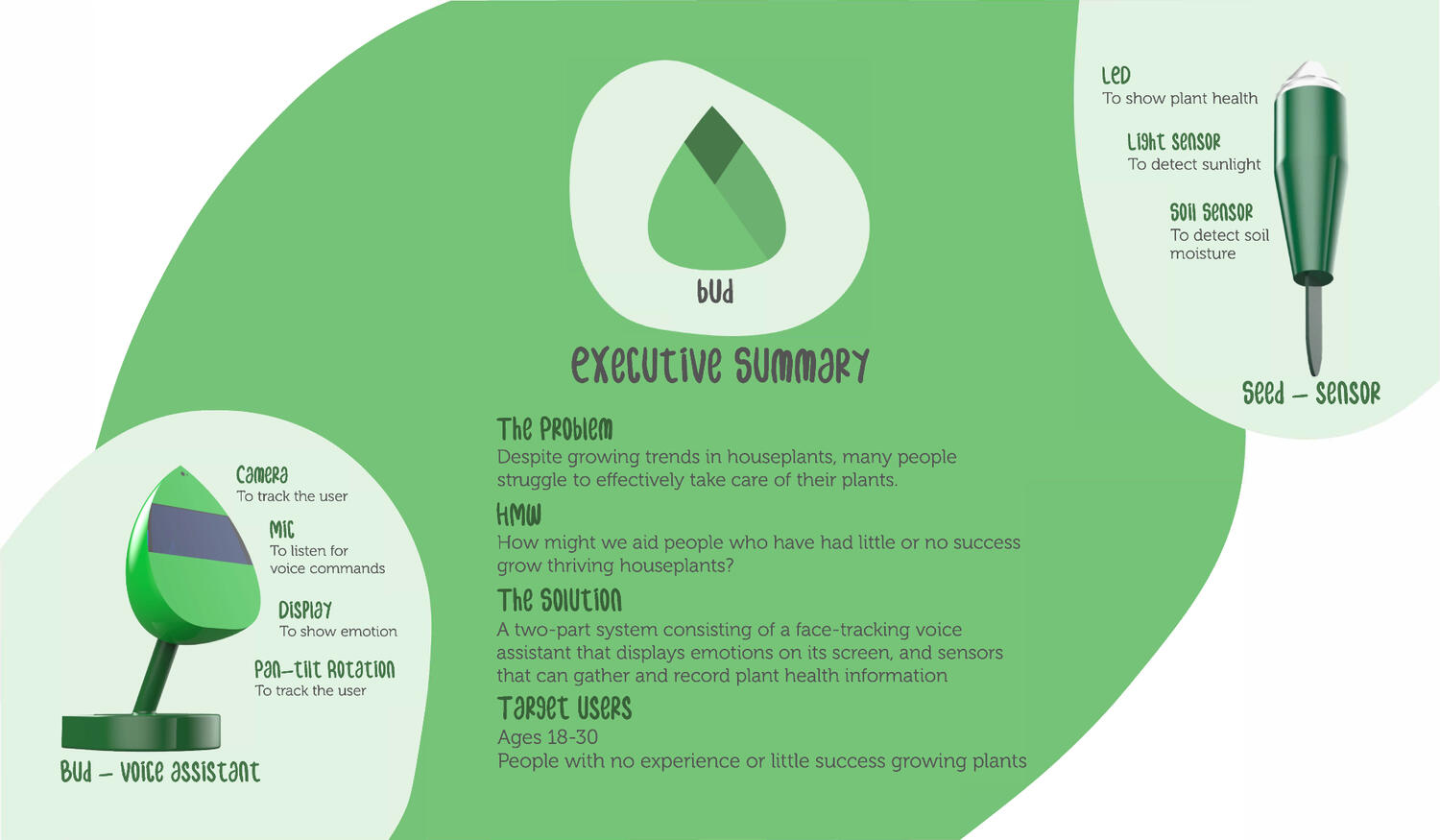
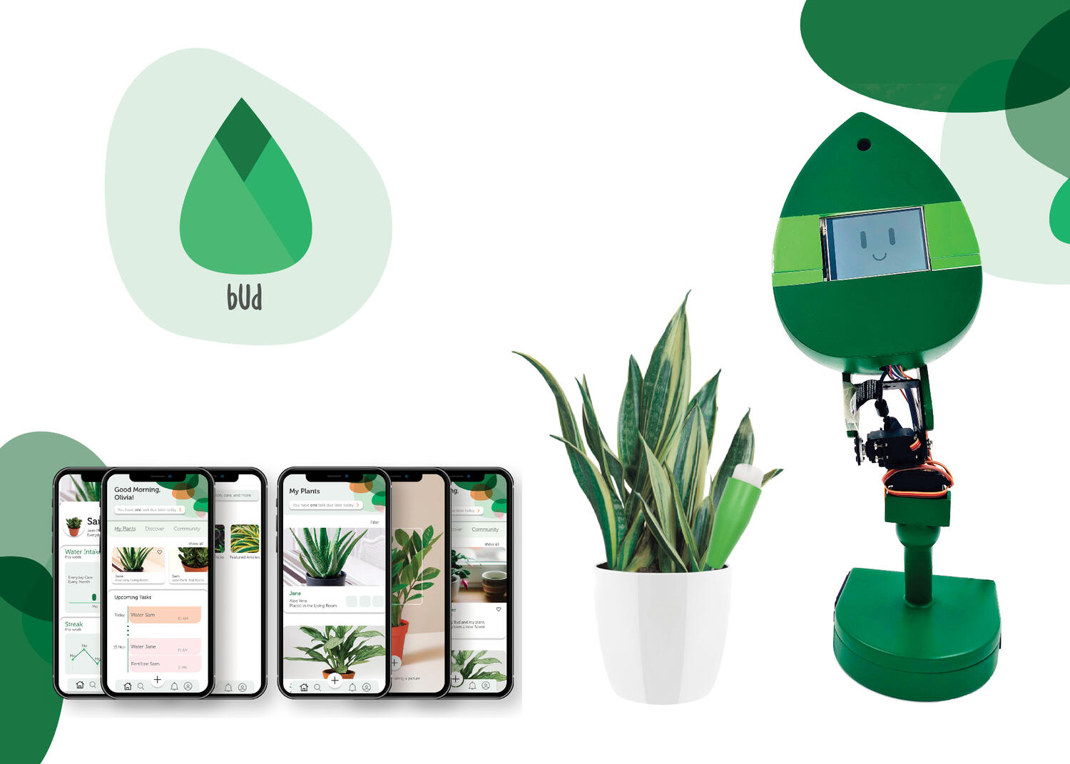
Bud: Social Robot
✦ Vision Video✦
This project was about designing and creating a concept to provide a solution to a real-world problem.Whether first-timers or intermediate enthusiasts, many plant owners are excited to observe and care for their plants. However, statistics show that many people also have little to no success in growing and maintaining thriving plants.From concept to model, our team presented a robot to remind and educate enthusiastic, first-time, plant owners how and when to care for their plants.My contribution to the project consists of the Vision Video (above), the Logo Animation, the Concept Sketches, the Interaction Model, the Storyboards in Action.
Tools: Windows OS, After Effects, Photoshop, Illustrator, InDesign, Wacom Intuos Pro Tablet, Wacom Cintiq

Executive Summary

Look Book

Logo Animation

Display of Emotions

Concept Sketch

Interaction Model

Storyboards
✦ Executive Summary✦
Flip through our Research & Process Book here:
Skim our Presentation here:
✦ Look Book✦
✦ Logo Animation✦
✦ Display of Emotions ✦


✦ Concept Sketch✦

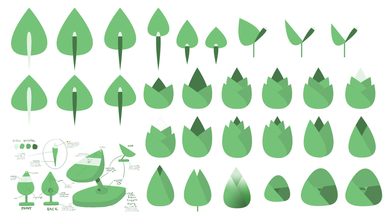
Conceptually, we wanted to create a robot that was in the shape of a simplified leaf, which included a screen for animated visuals, a microphone and speaker for audial input and output, and a stand as a sturdy base. We called the robot, Bud, as it was the start of our team and of a a plant before it blooms.The robot would also come with a sensor, Seed, which would detect the water levels and PH of the soil.
✦ Interaction Model✦

In the Interaction Model, we wanted to explain how the user would potentially interact with the product and vice versa.I created the visuals to be as charming and friendly as Bud's personality.
✦ Storyboards in Action ✦


Following our presentation, I depicted the two different audiences members who would want to interact with Bud and use it to maintain the growth of their plants.
See the project on Behance:
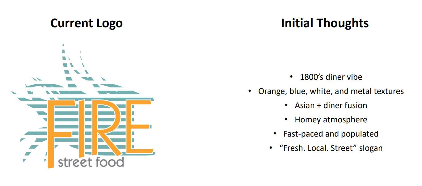
Fire Street Food
✦ Logo Redesign✦
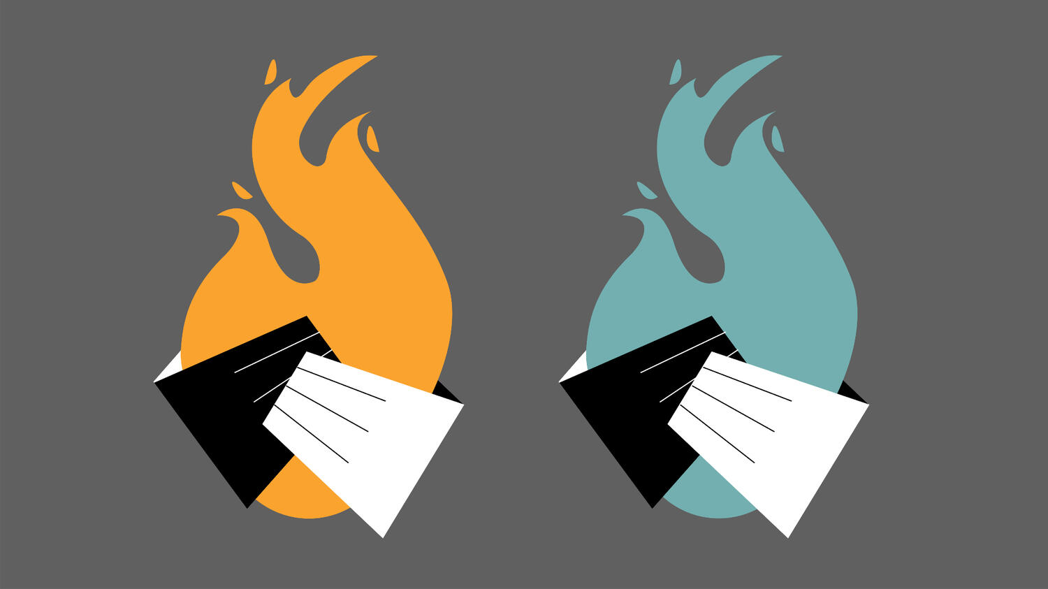
This project was about rebranding a local business' logo. I chose the sit-down restaurant, Fire Street Food, in Savannah, GA. It was one of the first Asian restaurants that I felt at home with, and fell in love with their South-East Asian American fusion dishes.Growing up in a restaurant myself, I was accustomed to observing my father toss woks while sautéing vegetables and eating his take on American Chinese food. I also grew up eating classic American breakfasts with my Godpapa at the local diner. When I moved to Georgia for college, I missed eating my father's food and the feeling of sitting down to eat, and started looking for a taste of home.With its Asian-meets-diner atmosphere, Fire Street Food has always had a warm place in my heart.I wanted to create a design that combined the feeling of Asian street food and carts with the casual vibe of diners, something sleek but also approachable, purposeful, and marketable.
Tools: Mac & Windows OS, Illustrator, Photoshop, Indesign Wacom Intuos Pro Tablet
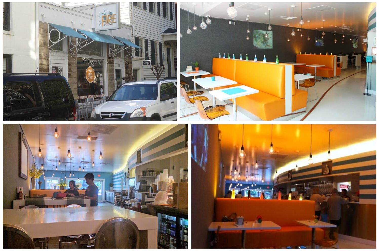
✦ Observations✦
Above and below are some observations I made of the logo and atmosphere while dining in.
✦ Thumbnails✦
I started thinking about what street food carts looked like, how Chinese food boxes fold, and how the blue and white stripes wrapped along the walls reminded me of photos taken with a fish eye lens.


✦ Process✦
I began drawing inspiration from the idea of fire, which was in the restaurant's name, and how warm and homey it felt. I paired the two hands holding a flame with the boxy nature of Chinese food containers and food carts.


✦ Mock Ups✦
Below are some ways that the logo might be seen, whether as a vinyl sticker on the door or a screen printed image on the staffs' uniforms.


Omnes

An exploration of my favorite font, Omnes, created by the designer, Joshua Darden. The brief was to display the biography of Omnes, its different font weights in multiple manners, and an understanding of typography.Omnes has a variety of font weights, from extra-light and dainty to extra-thick with rounded curves, as seen on pages two and three. The front and back covers are visuals of Darden's face, as I wanted to create a spotlight for Omnes' designer.Pages four through seven show a breakdown of typography, from ascenders to spines, ears to terminals.The overall color palette is a play on the complementary colors, purple-grey and a neon-like yellow.
Tools: Mac & Windows OS, Indesign, Illustrator
✦ Font Exploration & Research✦


Beijing Restaurant
✦ Menu + Graphic Design ✦


A menu design for a Chinese takeout place in my hometown. The orange color stimulates hunger, and the rest of the text is it's complementary color, blue. Even though there are a lot of items on the page, I wanted to focus on visual hierarchy and white space to allow the viewer to easily digest the menu and make their selection.
Tools: Photoshop, Illustrator, InDesign
☆ Fabrication ☆


Converge
✦ Typography + Embroidery✦
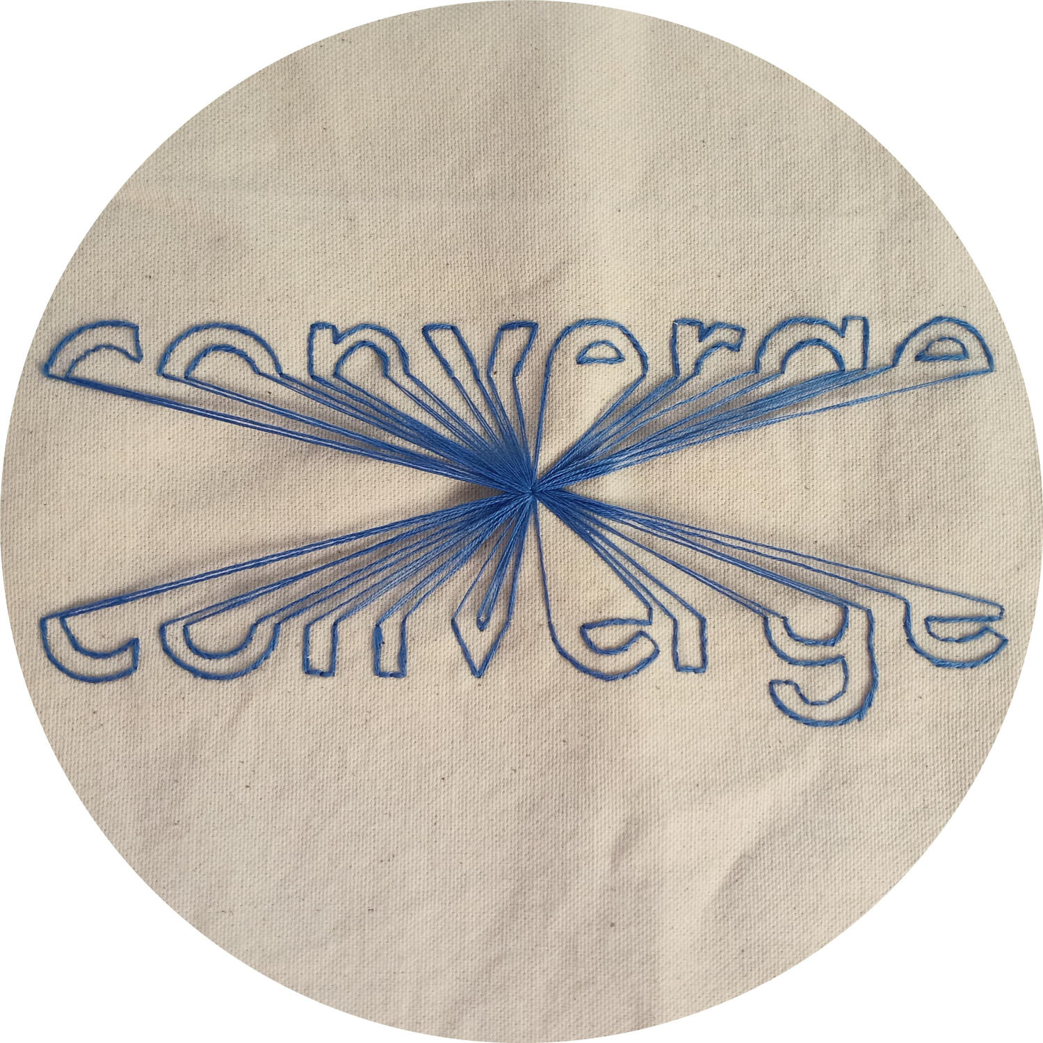
An embroidered fabric which depicts the definition of a word in action. The word I chose for this project is, converge, which means to "move toward one point or one another or come together," according to Merriam Webster.I had brainstormed other words as well, as seen below in my thumbnails, however, I wanted to weave my love for embroidery into my budding knowledge for design. This was an act of combining something I was familiar with, with something I was continuing to understand more about.The word, converge, was perfect for this project, as all of the lines of thread came together in a singular point in the center of the design. The font I chose was Futura because of its geometric but rounded curves; it would be easier to sew. I also chose a blue for the thread as a complementary color to the orange-yellowy color of the canvas fabric.
Tools: Cotton Canvas Fabric, Embroidery Thread & Needle, Embroidery Hoop
✦ Moodboard ✦


✦ Thumbnails✦


✦ Process✦


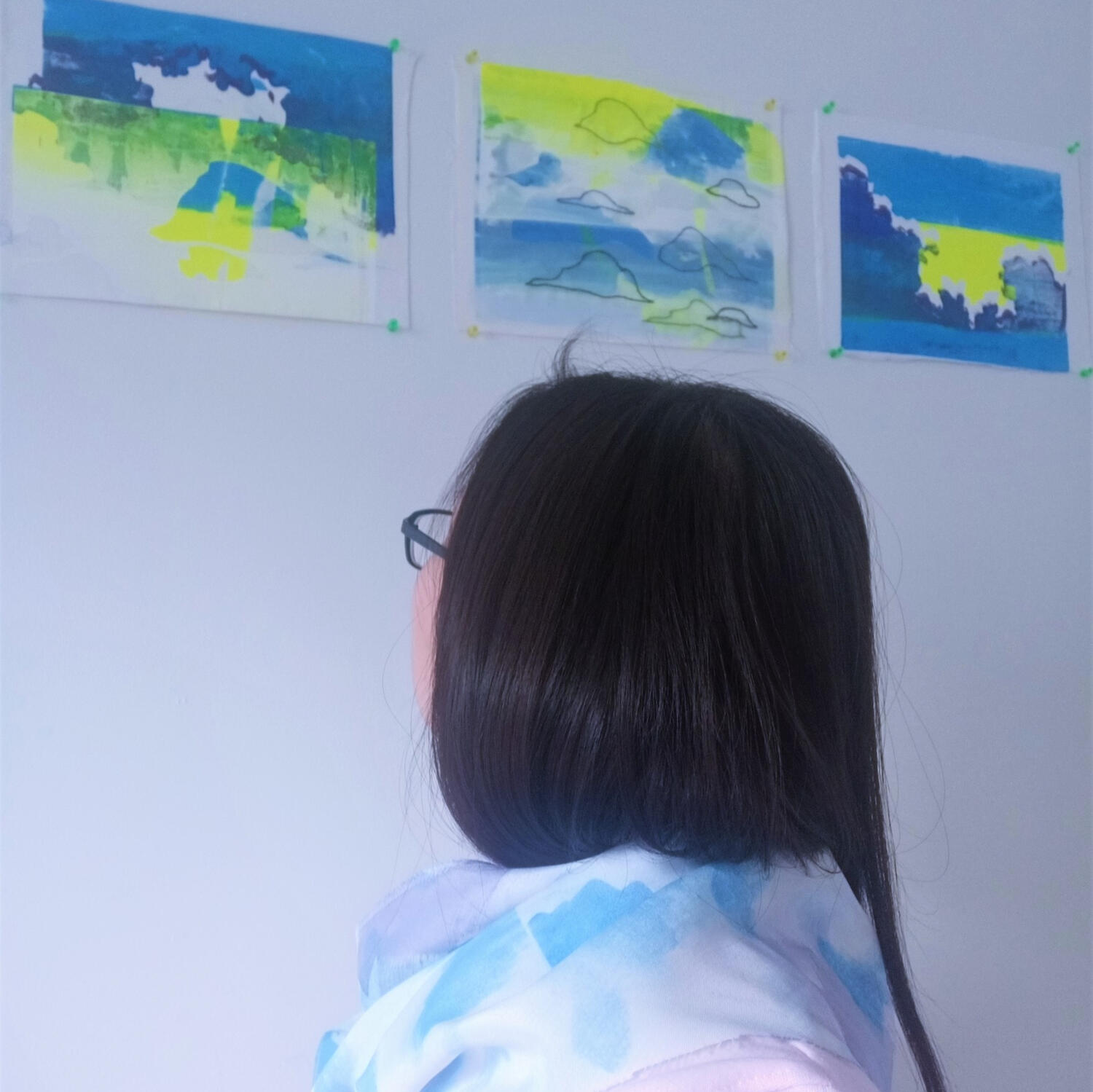
Repeat Pattern
✦ Digitalized Silk Screen Design for Merchandise✦

A screen-printed pattern, created with the intention of marketing on merchandise for Savannah, GA tourists.
I took the skills learned in my Fibers class and photos I had taken to create a collage, reminiscent of the clouds and architecture I loved so much while I was in Savannah.I took photos of historical architecture, then outlined them in Illustrator. The collage and pattern was created in Photoshop. The assignment was to have 12 colors in the color palette, and I wanted to stay true to the colors from the silk screening motifs.
Tools: Silk Screen, Ink, Photoshop, Illustrator, InDesign, 3D Paint, Wacom Cintiq


